
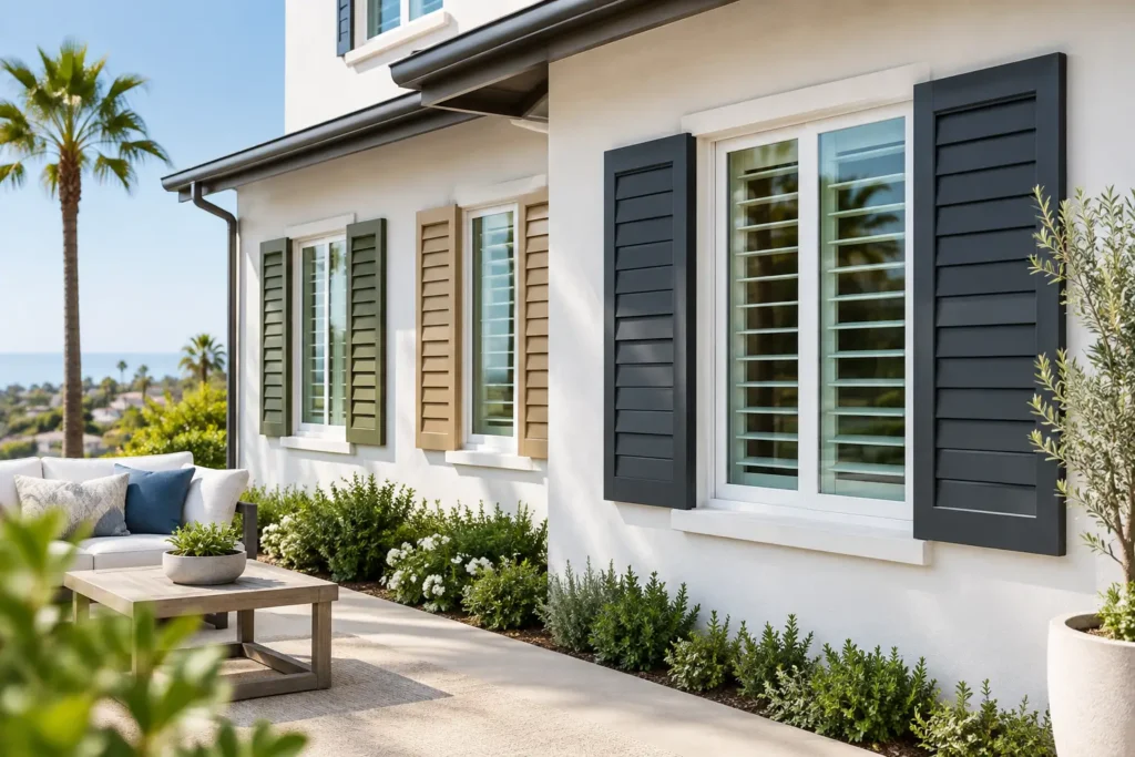
A shutter color can make a window disappear into a calm, cohesive room or turn it into a crisp architectural feature. That is why modern shutter color trends are moving beyond the default bright white choice. Los Angeles homeowners are choosing finishes that work with warm flooring, sun-filled rooms, textured walls, and the relaxed indoor-outdoor style common throughout the area.
The right color is never only about what is popular. It should support the room’s light, the home’s existing finishes, the view outside, and the way you want the space to feel every day. Custom shutters offer enough permanence that a thoughtful choice now can keep a room looking current for years.
Modern shutter color trends: softer, warmer, more personal
Pure white shutters remain a classic for good reason. They reflect light, pair easily with many design styles, and make trim look fresh. But the strongest shift is toward whites with softness and depth. Creamy white, ivory, light greige, and warm off-white finishes reduce the stark contrast that can occur between bright shutters and warmer paint, oak floors, or beige stone.
This direction works especially well in homes with organic materials and neutral palettes. A warm white shutter can still look clean and tailored without reading as cold. In a room with white walls, selecting a slightly warmer shutter can create subtle definition rather than making every surface blend together.
Greige and light taupe are also gaining ground for homeowners who want a neutral with more presence. These shades can connect cool gray elements with warmer furnishings, making them useful in transitional spaces. They tend to feel understated rather than trendy, provided the undertone is chosen carefully. A taupe with too much pink or gray may compete with the rest of the room under California’s strong natural light.
Natural wood tones bring warmth back to the window
Natural-looking wood and wood-grain finishes are another important part of current shutter color preferences. Pale oak, light maple, sand-toned finishes, and medium walnut-inspired colors bring texture to rooms that might otherwise feel overly smooth or monochromatic.
Wood tones are particularly effective in living rooms, dining areas, offices, and bedrooms with warm modern, coastal, Japandi, or mid-century influences. They create visual warmth without requiring darker walls or heavier drapery. In homes with existing wood flooring, the goal is usually coordination, not an exact match. A near-match can look accidental, while a noticeably lighter or darker tone often creates a more intentional layered effect.
There is a practical consideration here. Real wood shutters have a rich, natural appearance and are a strong option for many dry interior spaces. Composite or alternative wood materials may be a better fit for rooms where humidity and easy maintenance are greater concerns, such as bathrooms, kitchens, or laundry areas. The available finishes can differ by material, so color selection and product selection should happen together.
Charcoal and black create tailored contrast
For homeowners who prefer a bolder architectural look, charcoal and black shutters are no longer limited to industrial or ultra-modern interiors. Used well, they frame a view, echo dark hardware or window frames, and add definition to open-concept spaces.
Dark shutters are most successful when the room has enough daylight and a few other dark elements to tie them in. Black shutters beside black-framed doors, matte black lighting, or dark accent furniture can look deliberate and polished. They can also add visual structure to an all-white room that feels unfinished or overly plain.
The trade-off is that dark colors naturally show dust more readily and absorb more visual attention. In a small room with limited light, they may feel heavier than anticipated. Charcoal is often the more forgiving choice because it offers contrast while retaining softness. A sample viewed in the home is essential, since a color that appears almost black in a showroom may read as a softer gray in direct afternoon light.
Matching shutters to trim is still relevant, but not mandatory
For decades, the standard approach has been to match shutters to white window trim. It remains a reliable choice, especially for traditional homes, smaller rooms, and resale-conscious upgrades. A close trim match creates a finished built-in appearance that lets furnishings and artwork take the lead.
Today’s homes also make room for contrast. Matching the shutter to the wall can create a quiet, custom look, especially in bedrooms or offices where visual calm matters. Choosing a color slightly deeper than the wall can add dimension without making the window feel busy. In rooms with stained trim, a complementary wood-toned shutter may look more cohesive than forcing a white finish into the space.
The best option depends on what should be noticed first. If the view, artwork, or furniture is the focal point, a trim-matched or wall-blending color is often best. If the windows themselves have attractive proportions or a strong frame detail, contrast may be the better design move.
Consider the room before following a color trend
A color that feels right in a sunny family room may not be the right choice for a guest bath or home office. Light exposure, privacy needs, and the function of the room all affect the decision.
In bedrooms, warm whites, soft grays, and natural wood tones tend to support a restful atmosphere. In kitchens, a clean white, muted greige, or moisture-conscious finish can work with cabinetry and be easy to maintain. Bathrooms often benefit from materials designed for humidity, while their color can either match crisp tile or soften an all-white scheme.
For offices, darker shutters can look refined and help establish a more tailored setting, especially when paired with wood furniture. However, glare control and louver size deserve as much attention as color. The most attractive shutter will not improve a workspace if it does not manage direct sun on a screen.
What will still look good after the trend changes?
The most lasting modern shutter colors are usually the ones that connect to permanent elements in the home: flooring, cabinets, countertops, tile, trim, and window frames. This is why neutral colors remain so popular. They are flexible enough to accommodate new paint, furniture, or decor later.
If you love a stronger color, use it with purpose rather than selecting it solely because it is current. Charcoal can be timeless in a home with black-framed windows. A walnut tone can feel lasting when it relates to beams, flooring, or furniture. The finish should look like it belongs to the architecture, not like a temporary accessory.
It also helps to compare samples at different times of day. Morning light, west-facing afternoon sun, and interior lamps can all change how white, gray, or wood tones appear. Hold samples next to wall paint, trim, cabinets, and flooring rather than judging them in isolation.
Make the final decision in the actual space
Online inspiration is useful for identifying a direction, but it cannot show how a shutter color will respond to your room’s light and finishes. Professional measuring also matters because proper proportions, louver size, panel configuration, and installation quality affect whether shutters look custom or merely added on.
Blinds by Design brings the selection process to your home, so you can compare colors and materials where they will actually be installed. A free consultation gives you the chance to weigh warm whites against soft greige, natural wood looks against painted finishes, and bold contrast against a quieter trim-matched option.
Choose the color that makes the room feel more like yours when the shutters are open, closed, and somewhere in between. That is the finish most likely to remain satisfying long after the latest inspiration images have changed.